Event reporting and management
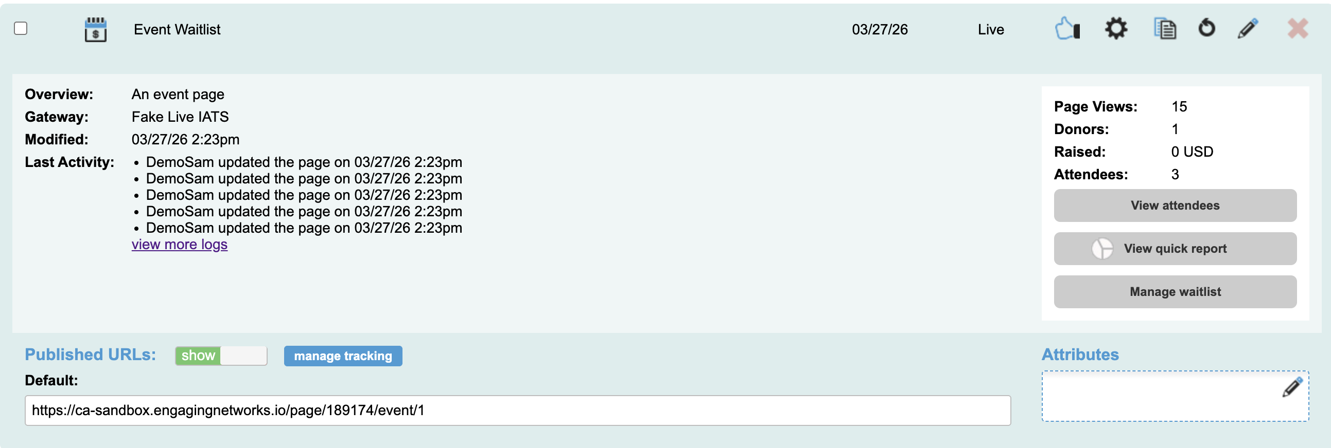
Events pages have various administrative tasks Users can complete to manage the Event, tickets, and the attendees. To access these tools, click to expand the Event page from Manage Pages menu.

View Attendees
To see a list of attendees for your event and make changes to them, click to expand the Event Page and select the![]() button. That will display a list of attendees and their information. You can change the columns included in the list by selecting the
button. That will display a list of attendees and their information. You can change the columns included in the list by selecting the ![]() and selecting additional fields.
and selecting additional fields.
 | Click this icon to view the full Attendee details. From this screen you can change the attendee detail values, ticket details, and can also mark the attendee as arrived |
 | Not arrived. Attendee status is marked as ‘attending’ |
 | Arrived. Attendee status is marked as ‘attended’ |
Quick Report
To see a quick report for your event and make changes to them, click to expand the Event Page and select the ![]() icon. There are metrics for the overall event and also individual tickets.
icon. There are metrics for the overall event and also individual tickets.
Field | Description |
|---|---|
Total ticket sales | The total number of tickets sold across all ticket types for the event. |
Total amount | The overall monetary value collected, including ticket purchases and any additional contributions. |
Total sales | The total revenue generated specifically from ticket sales (excluding additional donations). |
Total donation | The total amount contributed as additional donations on top of ticket purchases. |
Discount code used | The number of times discount or promo codes have been applied to purchases. |
Fee covered | The total count of transactions where a fee was covered |
Manage Waitlist
To see and manage a list of supporters who signed up for a ticket waitlist, click to expand the Event Page and select the ![]() icon.
icon.
Field | Description | ||||||
|---|---|---|---|---|---|---|---|
Ticket Type | Identifies the ticket the supporter is on the waitlists for | ||||||
Date | The date the supporter joined the waitlist | ||||||
First Name | The supporter’s first name. | ||||||
Last Name | The supporter’s last name. | ||||||
Email Address | The email address of the supporter. This address will receive the waitlist emails | ||||||
Status |
|
To release a ticket, select the box to the left of the supporter. Two additional buttons will appear on the screen.
 | Releasing the ticket will send the Ticket claim email to the supporter. Their status will shift to pending until they click through the email and submit the page to take the ticket which will update their status to claimed and they will be removed from the waitlist. |
 | This will remove the supporter from the waitlist |
