Blueprints
As a developer, you can define a blueprint that allows non-technical account users to customise an HTML template without manipulating the HTML themselves. When they create a new template based on your blueprint, they’ll be presented with options to change styles, content and much more. All defined by you.
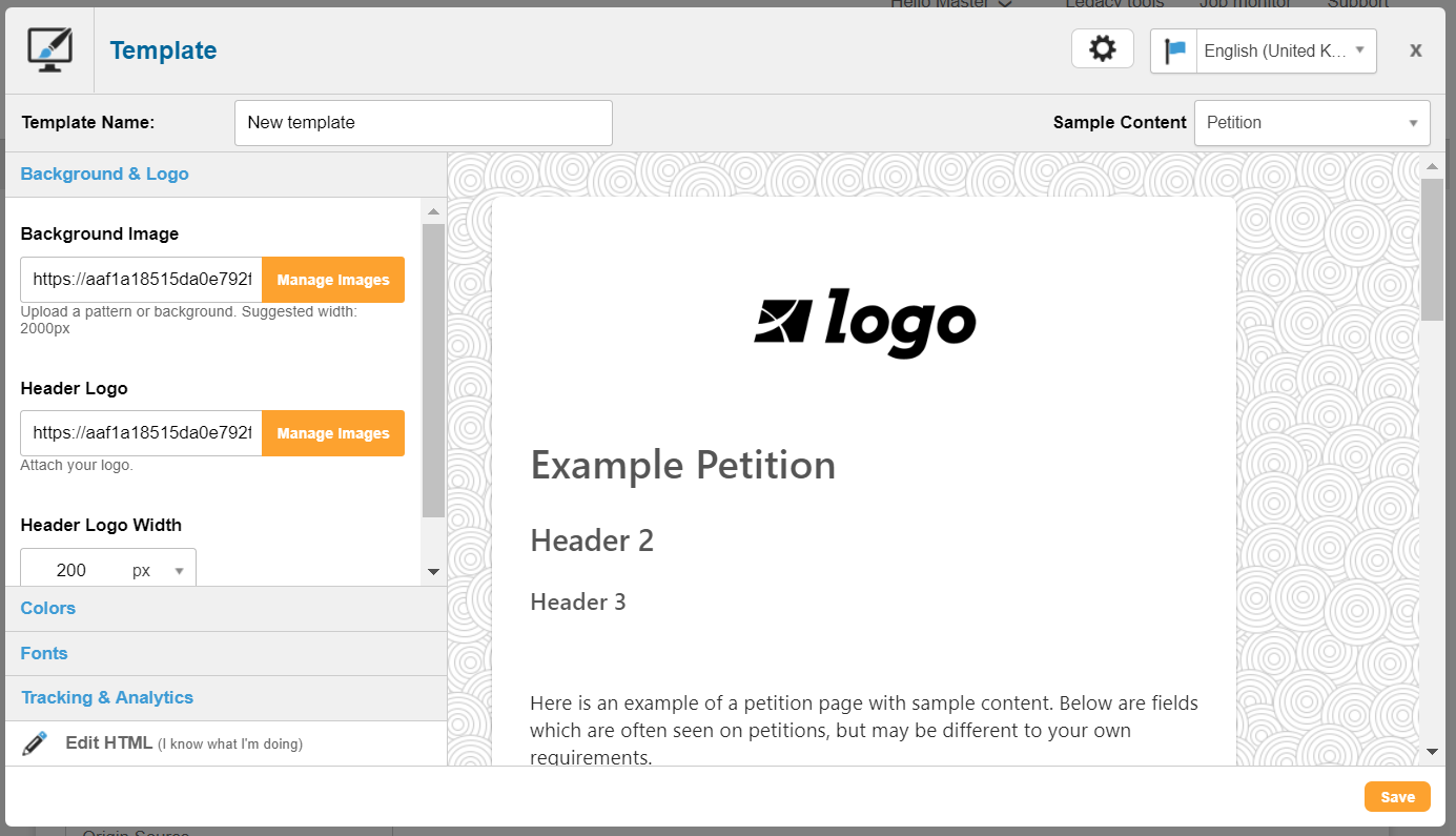
For example, you can define the blueprint to allow background color or banner image to be chosen. These options are listed via the blueprint’s “replacements” added in the HTML. When creating a template from the blueprint, the layout will show a preview of the template with the options listed on the side:
Creating a new blueprint
To create a new blueprint, go to Pages > Components > Templates. Then, click New template and click on the Template Blueprints tab.
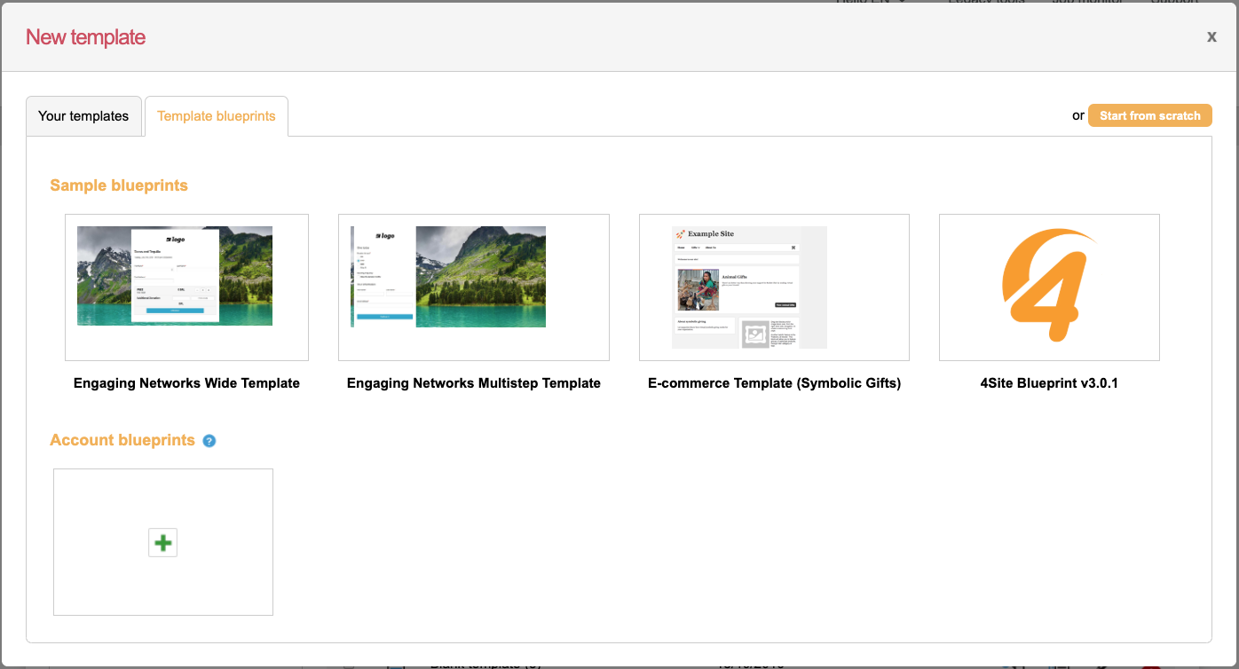
You’ll see two sections: Sample blueprints and Account blueprints. Sample blueprints are ones we provide for you, and account templates are the ones you have created yourself. Sample blueprints are covered in this article. We’ll go over account blueprints next.
Developing the blueprint
To create a new account blueprint, click the green + icon. You’ll see a blank blueprint when you first create it. It needs a Name, Thumbnail and short Description (which are displayed on the blueprints screen).
The Header and Footer contain HTML just like a standard HTML template. However, you have an additional function called “replacements”.
Inserting replacements
Replacements allow your users creating templates from blueprints to insert their own values.
To add a replacement, just insert your cursor where you want the insert to appear and then click “Insert replacement”. Or, you can also select existing text, e.g. a color “#333333” and click the button which will then use this as the default. A box will appear in which you can give your replacement some information for the user.
Name – the title of the replacement, e.g. “Background colour of banner” or “Logo URL”
Description – optional extra information to explain what the replacement is for
Replacement Type – the type of input that will be used to amend the replacement. The default is “Text”. See below for what each does
Replacement Token – when you insert your replacement into the HTML template, it will display like ${blueprint~bg} where the second parameter is the token you choose. These should be unique and it is recommended they are descriptive so when you read through your code you understand what they relate to
Initial Value – an optional initial value for the replacement
Section – the section box will categorise your replacements into sections. Give them the same name to group them together
When you insert the replacement, it will appear as a value within curly brackets, such as ${blueprint~bg}:
Replacement types
The possible replacement types, with examples, are:
Text – The most flexible input. A text box in which the user can type information into, such as heading text, a Google Analytics account number, or contact address for a footer  |
Textarea – A larger text box useful for longer paragraphs 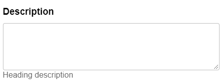 |
CSS Color – For choosing hexadecimal CSS colors, such as #aa0000 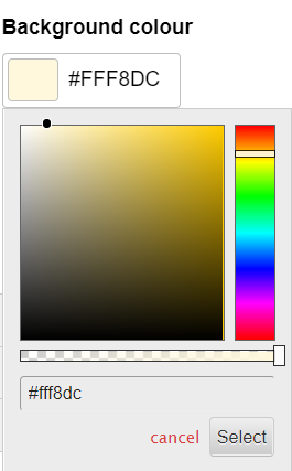 |
CSS Size/Dimension – this can be used to select sizes, for example a font size or image width. The units available are px, %, em, rem, pt, pc, vh, vw  |
CSS Margin/Padding – this can be used values of rules that can take four separate values (top, right, bottom, left), such as margin or padding. The example below would produce a value of “20px 20px 20px 20px”. The units available are px, %, em, rem, pt, pc, vh, vw 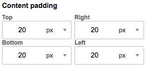 |
CSS Border – used for setting a CSS border property, with a width, border style and color  |
CSS Font – a dropdown of web fonts for a font-family property. Custom fonts are not available for this input, so they should either be hard-coded or if you need them to be editable use a text input 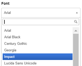 |
CSS Font with input – like the above, but contains an “Other” option at the end to type in your own font family, for example if using Google Fonts |
Image URL – an input that allows you to select, edit and upload images. Will insert the URL of the image. Useful for a background-image or as the “src” of an img tag  |
Custom dropdown – used to give the user a choice of values from a select input. For example, to select a URL of an image to limit the options, or to select whether a certain section is displayed or not, or from a limited list of headlines. 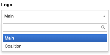 |
Custom dropdown with input – as the above, but with an “Other” option at the end for them to type their own value in. For example, this might be useful if you want them to choose from a list of common headlines with the option to make their own. |
Click Save once you are ready.
Using the Blueprints
To create a template from the Blueprint, highlight the new blueprint from the screen and click Select. Click Edit if you wish to amend it further.
Examples
This example shows an image URL insert being used to choose a background image:
html {
  background: url("${blueprint~backgroundimg}") repeat center center fixed;
}
This example applies a font and color:
#main-content {
 font-family: ${blueprint~primaryfont};
 color:${blueprint~primarycolor};
}
This example shows a replacement tag being used to insert a Google Analytics tracking ID:
<script>
  window.dataLayer = window.dataLayer || [];
  function gtag(){dataLayer.push(arguments);}
  gtag('js', new Date());
  gtag('config', '${blueprint~gatrackingid}');
</script>