Shared components
The shared component library in page-builder is where all of your images, files and shared components are stored. Shared components are items that can be used on multiple pages, such as HTML templates, ticket templates and display widgets (which are always stored as shared components), along with any text blocks, form blocks, code blocks or thanks emails that you have saved to the library.
Editing a shared component will change it everywhere it is being used. If you want the component to be “independent” and specific to a page, you can leave it unshared, or unlink a shared component.
Why use shared components?
Shared components are useful if you have common content that you use multiple times, and it would be a hassle to maintain it in several places. For example, you may have a privacy statement text block that you use on all your pages. By editing it in one place, all pages will inherit the change. Another example might be having a “Payment details” form block that you use on your donation pages.
HTML templates, opt-ins, questions and display widgets are always shared components.
When not to use shared components
You should not use a shared component for content that is different on each page, for example a description. Instead, keep the blocks unlinked so you can amend them without effecting other pages.
Since editing a shared component can change multiple pages at once, you may find that keeping several “page templates” with sample content and forms will suffice – users can then just duplicate the pages when they want to create a new page.
Accessing shared components
You access the shared component library by:
Clicking on the “load from library” button when creating or editing any of the component types mentioned above when editing a page, or;
Going to Pages > Components and going to the relevant section on the left, e.g. Text blocks, to edit the . You cannot create new blocks in this way.
Creating & Editing Shared Components
Shared components are created by creating a new text block, form block, or thank you email and then saving them to the shared component library.
To edit a shared component, you can edit the text block, form block, or thank you email directly and then save the changes to the library when prompted, or by editing the component within the shared library area (Pages > Components).
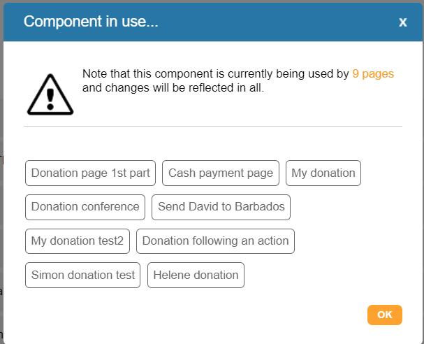
It will alert before saving to remind you that it is a shared component and lists any other pages also using the component:
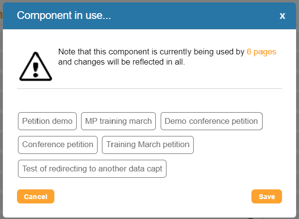
You also the option to unlink the component when editing it within a page if you do not wish to overwrite your changes to the saved component.
Editing components within the library will update all pages that share the component. Editing a shared component within a page will not instantly update other pages sharing it. To improve page load times, pages that need to be cleared and cached will form a queue to do so every few minutes. As a result, changes made to shared components may have a delay in taking effect. When the component is shared across fewer pages, there will typically be less lag time (i.e. 2-3 minutes if shared across < 50 pages; up to 20 minutes estimated if shared across hundreds of pages.
Adding shared components to pages
To use a component, click on it so it is highlighted and the “Use selected component” button will become active on the bottom right-hand side of the library.
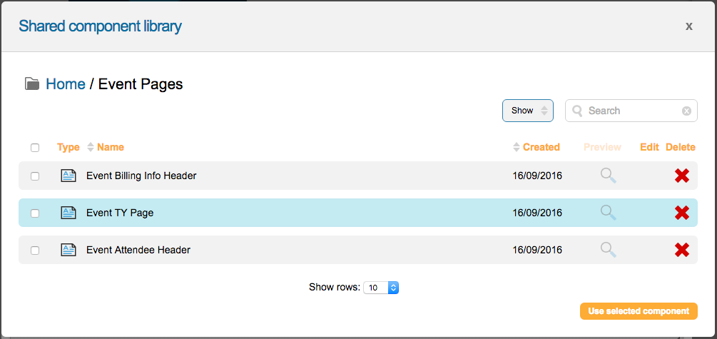
Click the button and the component will be added to your page.
Managing shared components
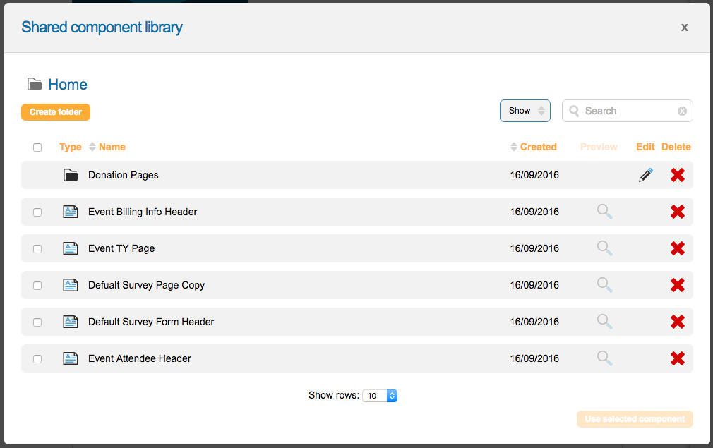
When you first open the shared component library, you will get an overview of the components stored in the library. From here, you can see what pages the component is on, edit the component, or delete the shared component.
Folders
You can organize your library by creating folders. Click on the “create folder” button and enter the name of your folder. Then, click “create”.
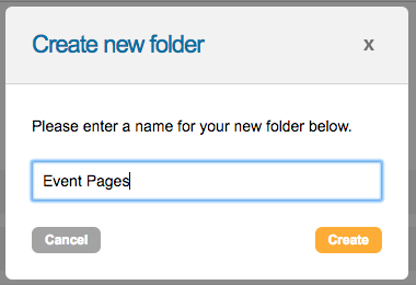
We only allow one level of hierarchy in the folder structure with “home” being the “root folder”. When you create a folder, all component types will see the same folder.
Search
By typing into the search box, it will display any components that meet your search criteria, no matter which folder they appear in.
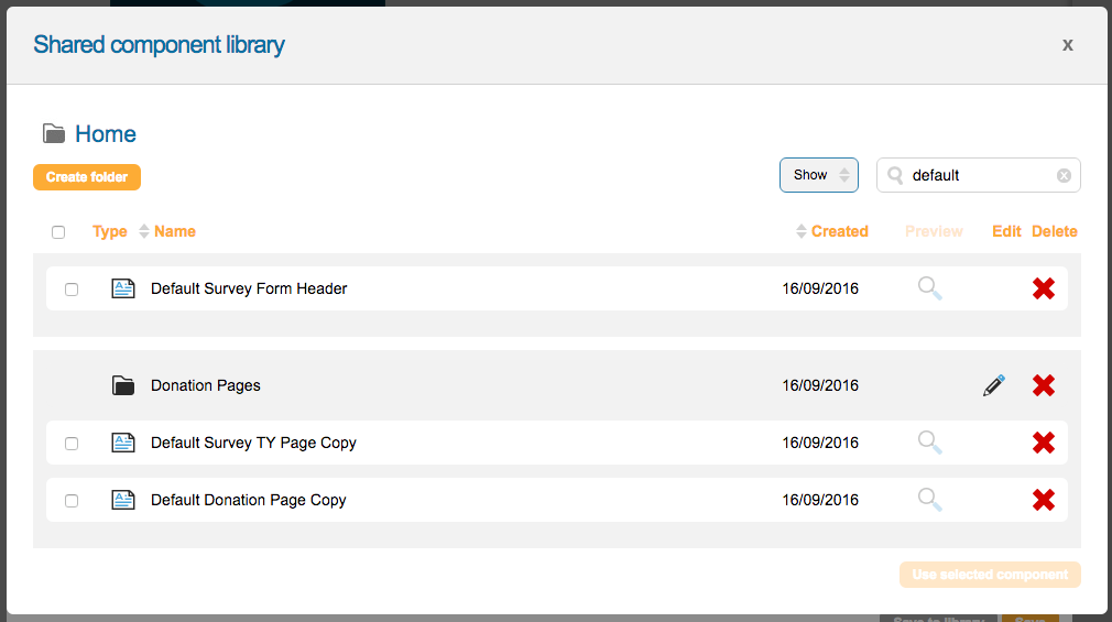
Show
You can toggle between active and archived components by clicking on the “show” button and switching the selected option.

Editing components
By clicking the edit icon (pencil), you can edit the component. This will display the standard editor for that type of component. See the relevant help page on the component to find out more.
Deleting components
You can delete a component from the library by clicking the red delete icon. You cannot delete a component if it is on a page.
Bulk action tools
To move or archive library components you can use the bulk action tools. You can also delete components in bulk this way.
To use the tools, click the checkbox next to the component(s) you would like to move. The bulk edit tools will appear above the list of components.
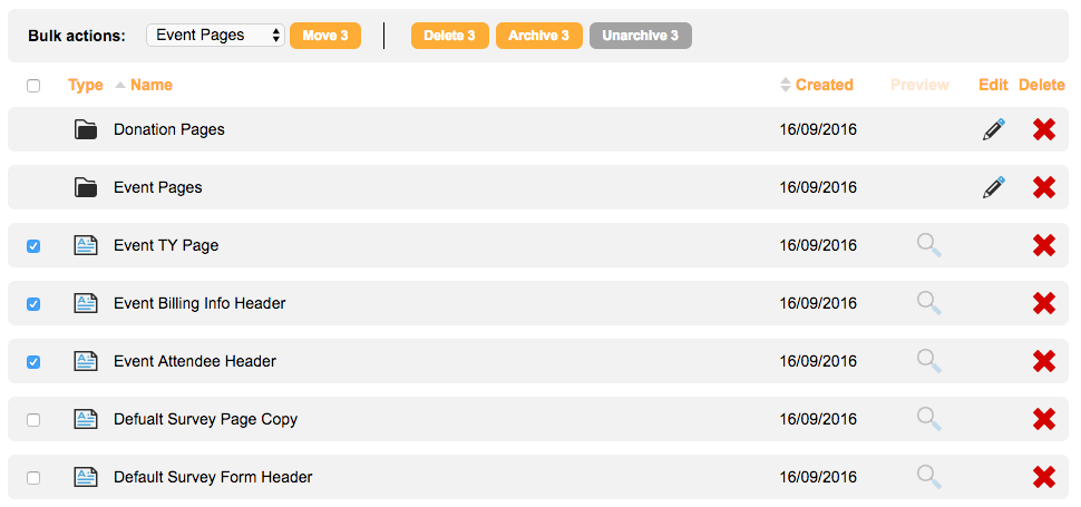
To move the selected components, select the folder you wish to move them to from the dropdown menu and click the move button.

To delete, archive, or un-archive the selected components, click on the corresponding button to preform the action.
Finding out where a component is in use
Click the associated pages icon next to a form block component to see where it is in use. You will see a pop-up displaying a list of pages:
