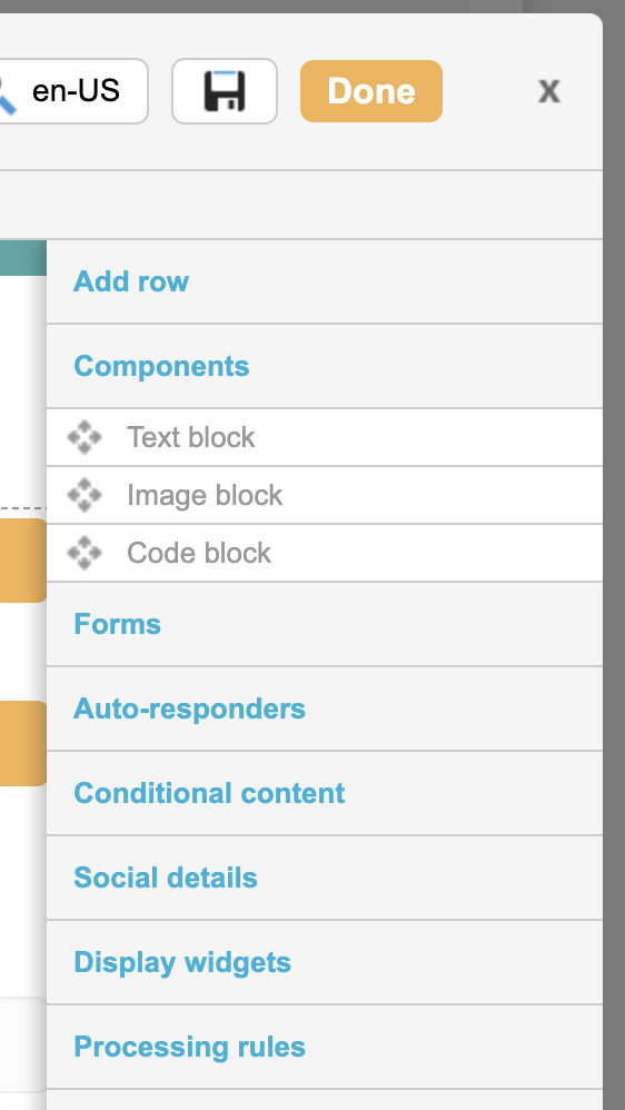
The Components menu under the right-hand toolbar when editing page-builder pages is used to add text, image and code blocks into your page. These are the components that give your page its content, such as headings, form fields and submit buttons.
These content blocks are customizable and text and code blocks can be saved to your shared component library to be used on other pages if you choose.
Adding components
To add a component to the page, expand the toolbar by hovering over it with your mouse. Click on Components to reveal the options. Using your mouse, drag the component you wish to use into your layout.