Text blocks
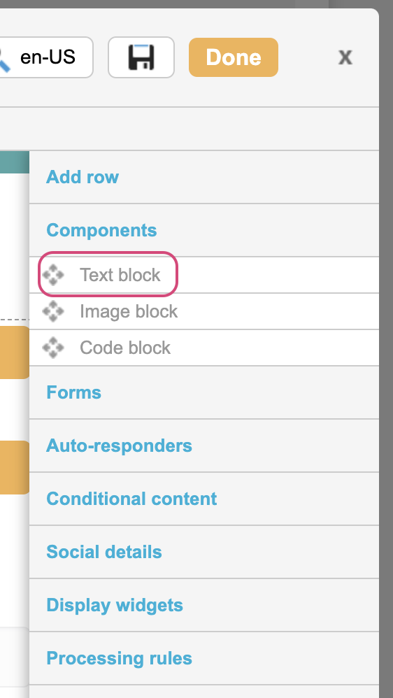
Text blocks are a frequently used component that can be dragged into your page-builder pages. They are used to display headings and text and also linked images. You can place multiple text blocks in a page. Like other blocks, they are placed inside rows.
You can drag a Text Block from the under toolbar’s Components menu. An editor will open and you can simply type in the text you want to add.
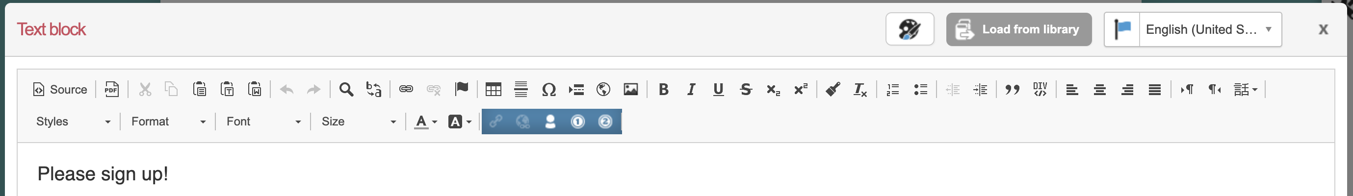
Rich Text Editor
Icon | Definition |
|---|---|
Saving Text Blocks
To save your changes, just click the Save button. If you want to save to the library (so that you can share the same text block across multiple campaigns) then click  . Library components can be edited in a page or via Pages > Components > Text blocks.
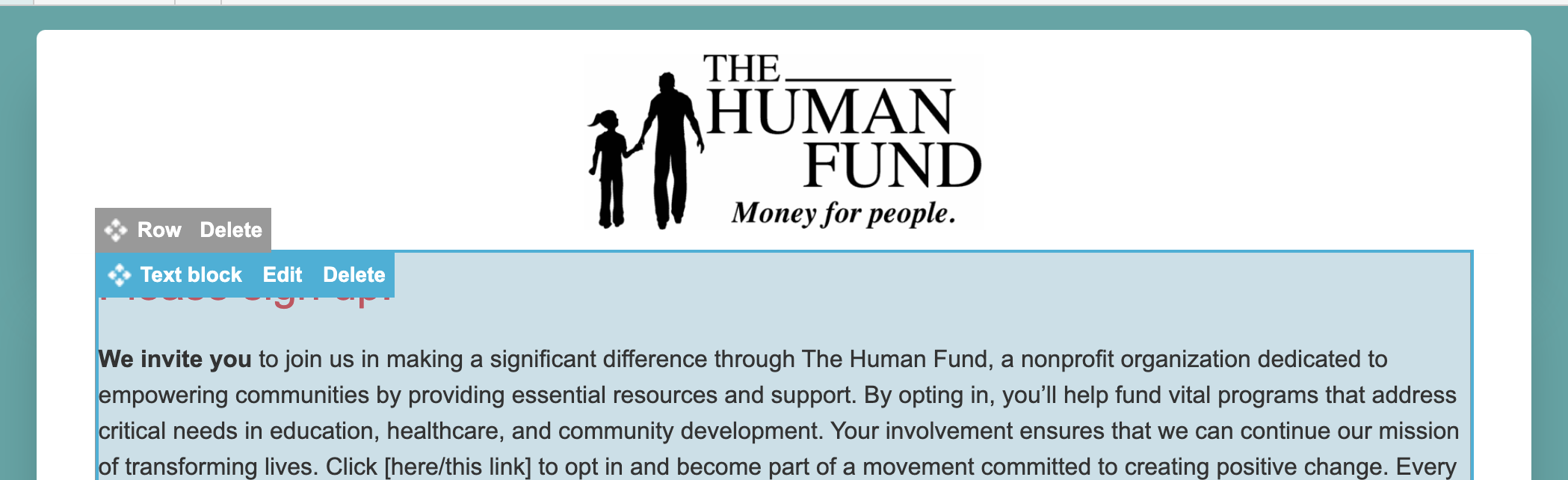
Editing Text Blocks
You can edit, delete or drag and drop an existing text block by hovering over the block in your page and clicking Edit or Delete or the  .
.
Mobile version
You can optionally add a mobile version of your content if you wish to display different content for mobiles. For example, you may want show less text, or if you don’t want the mobile version to display an image inside the text block. Note that your stylesheet should be used to handle responsive design.
To enable this, tick the  checkbox. This opens an additional WYSIWYG with the option to copy the content from above.
Styling using the palette icon
You can adjust some of the styles applied to the text block by clicking on the CSS editor icon 
Style | Description |
|---|---|
Custom class names | You can add a class to your text block which can be then be targeted using your CSS |
Font color | Set the font color of the text within the block. |
Background color | Set the background color of the block. |
Padding | Set the padding for the text block. These are measured in pixels, ems, rems, points, or as a percentage. You can also set top, right, bottom, and left sides independently. |
Margin | Set the margin for the text block. These are measured in pixels, ems, rems, points, or as a percentage. You can also set top, right, bottom, and left sides independently. |
Border | Set a border for the text block. These are measured in pixels, ems, rems, points, or as a percentage. You can also set top, right, bottom, and left sides independently. |
Border radius | Use this to add rounded corners to your text block. These are measured in pixels, ems, rems, points, or as a percentage. You can also set top, right, bottom, and left sides independently |
Locales
If you are using locales to display different content to different browser languages, you can switch to the different content of the text block by clicking on the flag icon top right.