
This blueprint has been designed and tested for all page types, except Symbolic Giving (formerly ecommerce) for which there is a dedicated blueprint template and Click to Call.
This is an all-round blueprint that can be used to create templates for your page-builder pages if you do not wish to design your own.
Features
-
The template is designed to work with almost all Engaging Networks page types, except eCommerce (for which there is a dedicated blueprint template) and Click to Call
-
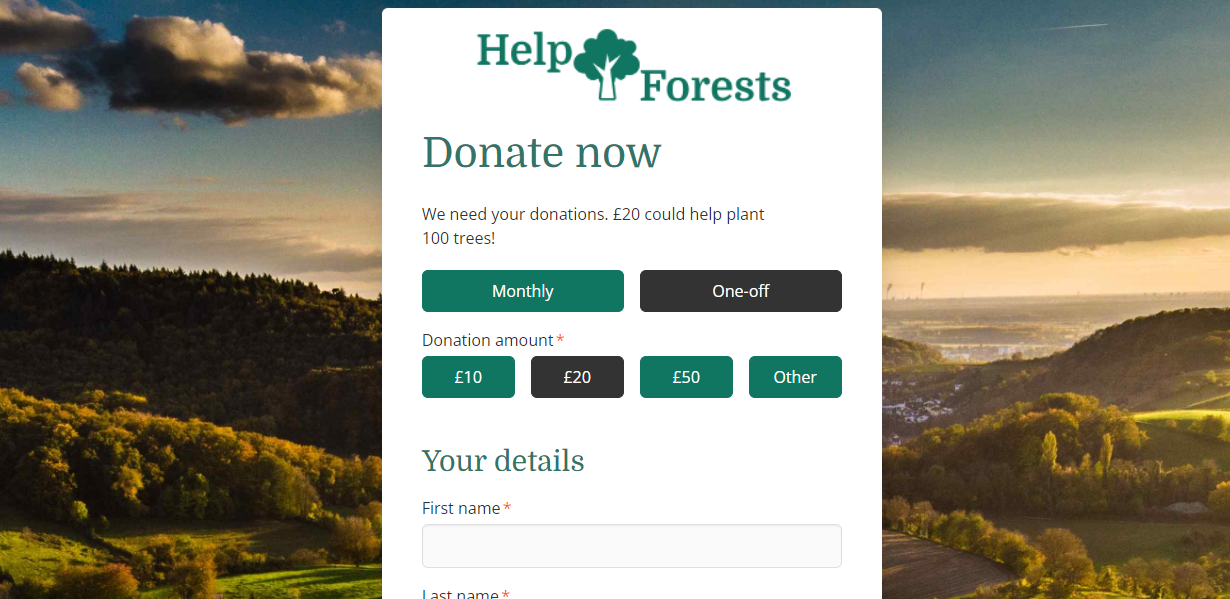
It features a full-screen fixed background image, or background colour
-
The content is within a white area on top of the image that can be positioned to the left, centre or right, or to support one or two columns
-
It is mobile optimised
-
There is support for custom or Adobe/Google Fonts*
-
You can add expandable “read more” text blocks
For other sample templates that are available, click here.
How to create a template from this blueprint
-
Go to Pages > Components, and then Templates on the left menu
-
Click New Template, and then click on the Template blueprints tab. This will list all Sample templates (that we provide) as well as any Account blueprints that you may have added yourselves
-
Under Sample templates, click on “Free & Flexible page template V2” (see below for a rundown), and then click Select
-
The editor will open. On the left you’ll see various vertical tabs that allow you to adjust different parts of the template that will be created from the blueprint. For more information on what is available, read the information on the blueprint you are working with below
-
Give the template a name and Save. This will create a new page template for you to use on your page or pages.
Editing Free and Flexible blueprint templates
Here’s a rundown of the blueprint options:
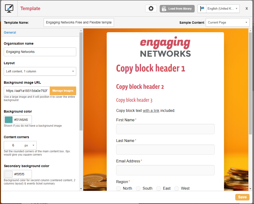
General
|
Item |
Description |
|
Organisation name |
The name of your organisation. This displays in the tab title in your browser, along with the page name, for example:
|
|
Layout |
The layout of the page. You have four options. If you are unsure which to use, why not try a split test of two layouts?
|
|
Background image URL |
The background image of the page. This will be resized to fill the entire background but not distorted |
|
Background colour |
The background colour of the main page. This will show if you do not have a background image |
|
Content corners |
Set the rounded corners of the main content box. 0px would give you square corners |
|
Secondary background colour |
The background colour of the second column if using the two column layout. |
|
Link colour |
The colour of text links |
Logo
|
Item |
Description |
|
Logo image URL |
The URL of your logo that is shown at the top of the content |
|
Logo alignment |
The horizontal position of the logo – middle is default, or choose left or right |
|
Logo width |
The width of your logo that is shown at the top of the content |
|
Logo height |
The height of your logo that is shown at the top of the content. Leave as “auto” and it will be in proportion based on its width |
|
favicon image URL
|
The URL of the “favicon”. This is the small image that appears in the browser tab |
Submit button
|
Item |
Description |
|
Button background colour |
The background colour of the buttons (submit buttons and donation buttons, if using) |
|
Button background colour (on hover) |
The background colour of these buttons that shows when the cursor hovers over them. If you don’t want this effect, keep both colours the same |
|
Button corners |
Set the rounded corners of the button. 0px would give you square corners |
|
Button font colour |
The font colour of your submit button. This defaults to white |
|
Button font colour (on hover) |
The font colour of your submit button when hovered over. This defaults to white |
Fonts
|
Item |
Description |
|
Default font familyu |
The font that is used for all text on the page. You have a choice of all built-in browser fonts such as Arial and Verdana. If you wish to use an other font, choose “Other”. You will need to add any font code though which you can do under the “Fonts (advanced)” tab. |
|
Root font size |
The base font size for all paragraph text. Headings are proportionately larger than this |
|
Main font colour |
The colour of all other text |
|
Headings colour |
The colour of the Headings in your text blocks. If you want, can change individual heading types under Fonts (advanced) |
Fonts (advanced)
|
Item |
Description |
|
Custom fonts
|
If you wish to use a font other than the ones provided, you can use Google Font’s service** by pasting in the code they give you. Or you can upload your own font files and use this to assign a font name to the file. |
|
Heading 1 font family |
By default, Heading 1 will use the root font. But if you can change it here if you want a different heading to your paragraph text. |
|
Heading 2 colour |
Defaults to be the same as Heading 1 if left as var(–h1_color) |
|
Heading 2 font family |
As for Heading 1 font family |
|
Heading 3 colour |
As for Heading 2 colour |
|
Heading 3 font family |
As for Heading 1 font family |
|
Heading 4 colour |
As for Heading 2 colour |
|
Heading 4 font family |
As for Heading 1 font family |
Donation pages
These items are specific to Donation pages only.
|
Item |
Description |
|
Donation amount input type
|
If using radios for your donation amounts to offer a string of choices, you can keep their style as radios or as buttons via this option |
|
Donation frequency input type |
If using radios for your donation frequencies to offer a string of choices (e.g. monthly or annually), you can keep their style as radios or as buttons via this option |
|
Donation recurring payment input type |
If using radios for your Recurring Payment field (that sets whether the donation will be recurring “Y” or not “N”), you can keep their style as radios or as buttons via this option |
|
Donations buttons colour (selected) |
For the buttons options, this sets the colour of the donation buttons' background when selected |
|
Donations buttons colour (unselected) |
For the buttons options, this sets the colour of the donation buttons' background colour when it is unselected |
|
Donations buttons colour (on hover) |
For the buttons options, this sets the colour of the donation buttons' background colour when it is hovered over |
|
Donations buttons font colour (selected) |
For the buttons options, the sets the colour of the font when selected |
|
Donations buttons font colour (unselected) |
For the buttons options, the sets the colour of the font when unselected |
|
Donations buttons font colour (on hover) |
For the buttons options, the sets the colour of the font when hovered over |
One click donations
These items style one click donation pages, which display when the right conditions are met. You would need to set the template for the one click donation page for this to work.
|
Item |
Description |
|
One click currency symbol
|
This sets the currency symbol (e.g. $) for the amount buttons, and submit button if you are displaying the value there too, in one click donation pages |
|
One click submit button label |
This sets the text on the submit button for one click pages, for example “Donate” or “Give” |
|
Add amount to end of submit button |
If “Yes” is chosen, this will add the selected donation amount after the submit button’s label, set above. For example, if the label is “Give” and the supporter has selected £20, this will display “Give £20” on the button |
Event pages
These items are specific to Event pages only.
|
Item |
Description |
|
Ticket block Additional Donation display |
Show or hide the “Additional donation” box in the ticket block |
|
Ticket block Promo Code display |
Show or hide the “Promo Code” box in the ticket block |
Extras
|
Item |
Description |
|
Add jQuery |
If you want the latest jQuery library added to your template’s header, choose Yes. No is default |
|
Header scripts (script tags included) |
Any other scripts, such as Google Analytics, Tag Manager or Facebook Pixel, can be pasted here and they will be put into the <head> of the template. Do not include<script> tags here. If you wish to, you can edit the template directly for more flexibility |
|
Mandatory asterisk |
Show a * after mandatory fields. You can show or hide it with this option |
Additional functionality
Once created, there is additional functionality you can take advantage of within the page-builder.
|
Item |
Description |
|
Events pages ticket block |
The ticket block does not show the submit button when using this template. Instead add your own via a Form Block |
|
Read more |
Any block can be made to “click to expand” by adding the following class to it via the block’s style section (palette icon): HTML
|
|
Hide |
Add the hide class (via a block’s Palette icon and in the Custom class names box) to hide the block in preview/live mode but not in the page-builder |
|
Troubleshooting |
Need to troubleshoot the layout? Add this to the <body> tag: |
|
Personal information title |
To style a heading with a prefixed icon for your personal information heading (must be Heading 2), add the following class to the text block via its style section (palette icon): |
|
Personal information form block |
To layout a form block that contains the fields First Name, Last Name & Email Address, add the following class to the text block via its style section (palette icon): |
|
Address title |
To style a heading with a prefixed icon for your address heading (must be Heading 2), add the following class to the text block via its style section (palette icon): |
|
Address form block |
To layout a form block that contains the fields Address 1, Address 2, City, Region, Postal Code & Country, add the following class to the text block via its style section (palette icon): |
|
Payment information title |
To style a heading with a prefixed icon for your payment information heading (must be Heading 2), add the following class to the text block via its style section (palette icon): |
|
Personal information form block |
To layout a form block that contains the fields Payment Type, Credit Card Number, Credit Card Expiration [split select] & Credit Card Verification Value, add the following class to the text block via its style section (palette icon): |
Using Google Fonts
See this article for more information
* Due to recent EU decisions on GDPR it has been determined that some Google services, which includes Google fonts and scripts, are not compliant with GDPR due to the processing of IP addresses (IP address counts as Personally Identifiable Information (PII) under GDPR). The purpose of this email is simply to notify you of this ruling. If you have used Google fonts or scripts in any of your Engaging Networks pages, we recommend you download them from Google, upload them as assets into the Engaging Networks file library and then refer to these assets in your templates instead. This will remove any connection with Google’s servers and will prevent any data transfers occurring.