Visual Reports (legacy)
These are the legacy visual reports available in Engaging Networks. For the more recently released reporting tools, see this article.
Visual Reports display a visual representation of your account activity, including donations over time, advocacy actions and email.
What reporting tools are available?
You can build or view reports in three different ways:
Create a query through the data export process and then download the resulting file of raw data
Use our Data Reports to download a spreadsheet of summary information
View a graphical representation of key data and metrics in your Engaging Networks dashboard, as detailed in this article
Individual reporting data (the constituent data and transaction data for a single supporter) is accessed through the ‘Manage Supporters’ page in the dashboard.
Accessing Visual Reports
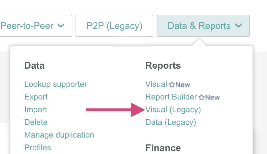
To access the reporting tools, go to the main Data & Reports > Visual (Legacy). Reports are organized into six categories: Account, Advocacy, Fundraising, Email, Peer to Peer and All.
Account
Overview
This takes you to the account overview reporting page. This page displays information to help you monitor high-level metrics like the number of new constituent records created, the percentage of active supporters in your database, etc.
You can change the duration breakdown to either Quarterly or Monthly and can also choose a timeframe when to display data through.
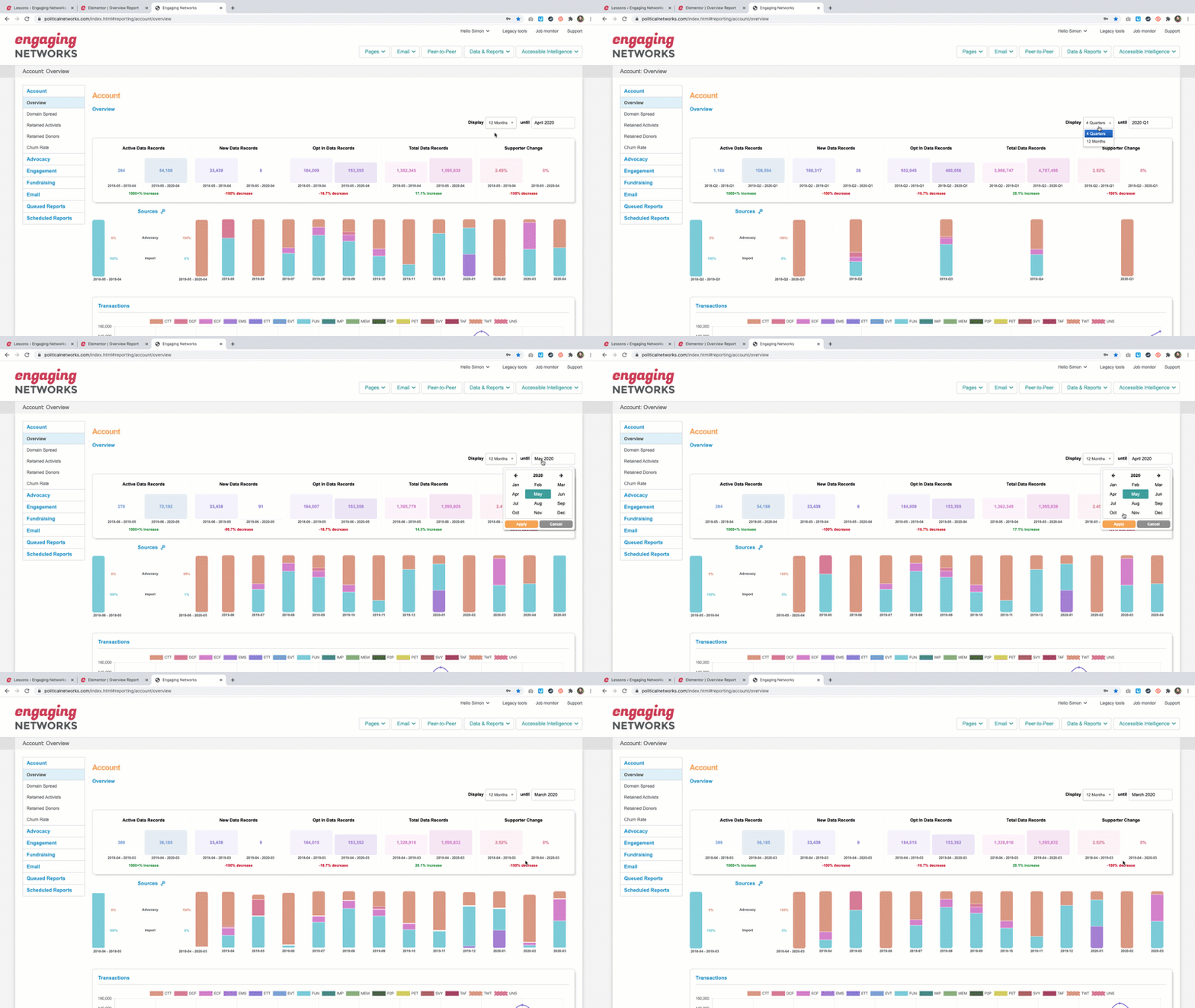
The main graph when the default page loads will show you key metrics with a year over year comparison based on the duration and timeframe selections:
Active data records: Supporters who have taken at least one action (any other than email click or open) in the last 18 months
New data records: New supporters added to the account. This includes transactions for new supporters and imported data
Opted-in data records: Supporters who have any current ‘Opt in = Y’ records in the account
Total data records: Total unique records in the account
Supporter change: The percentage of change in the account.
Sources
This will display how supporters were added to your account with a Monthly or Quarterly breakdown based on your selection. Clicking to select a month or quarter will update the key metrics above to display metrics from that time period and a year over year comparison.
Transactions
This is a line graph with the number of transactions by type during the selected timeframe.
Devices
Pie graphs illustrating the supporters’ device for advocacy, fundraising and engagement actions.
Domain Spread
This will display the top 20 domains of supporters in the account broken out by active, new, opted in, and total data records. This report can only be displayed by month, but the timeframe can be changed.
Retained Activists
This reports on the percentage of supporters that took action in the last 12 months compared to the 12 months before that. So for example, the percentage of supporters that took action between July 2018 and July 2019 over those between July 2017 and July 2018. This report can only be displayed by month, but the timeframe can be changed.
Retained Donors
This reports shows the rate of supporters that donated in the last 12 months compared to the 12 months before that. This report can only be displayed by month, but the timeframe can be changed.
Churn Rate
The churn rate shows the percentage of opted-in supporters that have been lost in a month. This includes unsubscribes, hard bounces and spam complaints. For example, if you started the month with 100 opted-in records, and over the course of the month 2 unsubscribed, and 1 hard-bounced, then the churn rate will be 3%. This report can only be displayed by month, but the timeframe can be changed.
Filtering
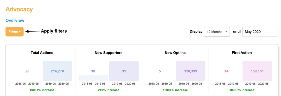
There is the option to apply filters to the Advocacy, Engagement and Fundraising visual reports . The filters are the same as filters available in the profile tool that can be found under Data & Reports > Profiles. You can read more about the available profile filters here: http://www.engagingnetworks.support/knowledge-base/supporter-profiles/#available-filters
After applying filters to the reports, the report will run and be available under Queued Reports once it is done.
Advocacy
Overview
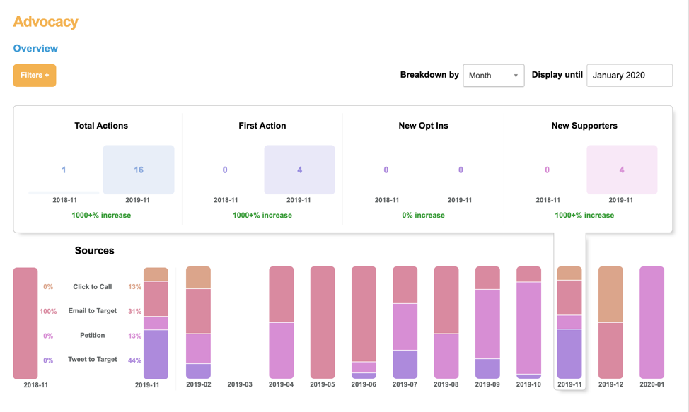
This report includes a summary of actions taken on Click to Call, Email to Target. Petition, and Tweet to Target pages. This report can be displayed by quarter, month or day breakouts and the timeframe can be changed.
The main graph when the default page loads will show you key metrics with a year over year comparison based on the duration and timeframe selections:
Total Actions: Participations on Click to Call, Email to Target, Petition, and Tweet to Target Pages for the highlighted periods. Supporters taking action in the same campaign, more that once in a day, would be counted as 1.
First Action: Number of first time actions by supporters
New Opt Ins: Number of the new supporters, who answer Y to an opt in question on taking action
New Supporters: Number of supporters taking their first action
Sources
Displays actions by page type with a Monthly or Quarterly breakdown based on your selection. Clicking to select a month or quarter will update the key metrics above to display metrics from that time period and a year over year comparison.
Top Pages: The five most active advocacy pages based on the total number of transactions processed within the selected date range. The name of the page is displayed along with the total number of transactions.
Top Origins: The five most active origin sources with the highest number of advocacy actions . The origin is displayed along with the number of transactions processed.
Top Tracking: The five most active tracking values applied to any advocacy transaction type. The tracking value is displayed along with the number of transactions processed.
Email Conversions: Five most active emails campaigns for advocacy actions
Devices
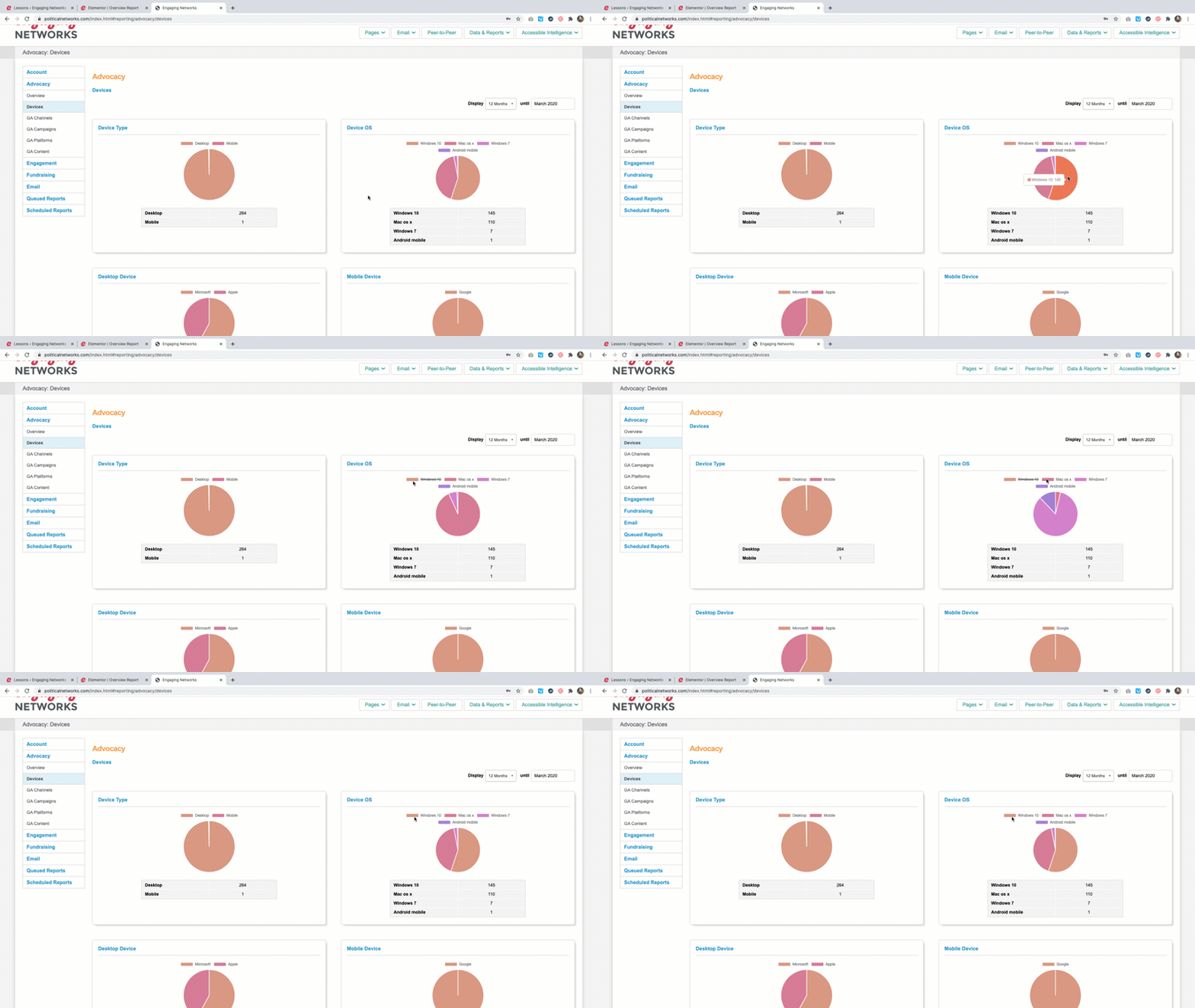
Pie charts breaking out the number of advocacy actions by supporter’s device, browser and operating system. This report can be displayed by quarter or month or day breakouts and the timeframe can be changed.
Device Type
Device OS
Desktop Device
Mobile Device
Desktop Browser
Mobile Browser
Values can be toggled on and off by clicking to add and remove them from the charts.
GA Channels
Count of advocacy actions by Google Analytics Channel (utm_source). This report can be displayed by quarter or month breakouts and the timeframe can be changed.
GA Campaigns
Count of advocacy actions by Google Analytics Campaign (utm_campaign). This report can be displayed by quarter or month breakouts and the timeframe can be changed.
GA Platforms
Count of advocacy actions by Google Analytics Platforms (utm_medium) This report can be displayed by quarter or month breakouts and the timeframe can be changed.
GA Content
Count of advocacy actions by Google Analytics Content (utm_content). This report can be displayed by quarter or month breakouts and the timeframe can be changed.
Engagement
Overview
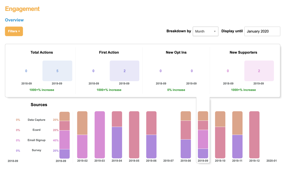
This report includes a summary of actions taken on Data Capture, Ecard, Email Signup and Survey pages. This report can be displayed by quarter, month or day breakouts and the timeframe can be changed.
The main graph when the default page loads will show you key metrics with a year over year comparison based on the duration and timeframe selections:
Total Actions: Participations on Data Capture, Ecard, Email Signup and Survey pages for the highlighted periods. Supporters taking action in the same campaign, more than once in a day, would be counted as 1
First Action: Number of first time actions by supporters
New Opt Ins: Number of the new supporters, who answer Y to an opt in question on taking action
New Supporters: Number of supporters taking their first action
Sources
Displays actions by page type with a Monthly or Quarterly breakdown based on your selection. Clicking to select a month or quarter will update the key metrics above to display metrics from that time period and a year over year comparison.
Top Pages: The five most active engagement pages based on the total number of transactions processed within the selected date range. The name of the page is displayed along with the total number of transactions.
Top Origins: The five most active origin sources with the highest number of engagement actions. The origin is displayed along with the number of transactions processed.
Top Tracking: The five most active tracking values applied to any engagement transaction type. The tracking value is displayed along with the number of transactions processed.
Email Conversions: Five most active emails campaigns for engagement actions
Devices
Pie charts breaking out the number of engagement actions by supporter’s device, browser and operating system. This report can be displayed by quarter or month or day breakouts and the timeframe can be changed.
Device Type
Device OS
Desktop Device
Mobile Device
Desktop Browser
Mobile Browser
Values can be toggled on and off by clicking to add and remove them from the charts.
GA Channels
Count of engagement actions by Google Analytics Channel (utm_source). This report can be displayed by quarter or month breakouts and the timeframe can be changed.
GA Campaigns
Count of engagement actions by Google Analytics Campaign (utm_campaign). This report can be displayed by quarter or month breakouts and the timeframe can be changed.
GA Platforms
Count of engagement actions by Google Analytics Platforms (utm_medium) This report can be displayed by quarter or month breakouts and the timeframe can be changed.
GA Content
Count of engagement actions by Google Analytics Content (utm_content). This report can be displayed by quarter or month breakouts and the timeframe can be changed.
Fundraising
Overview
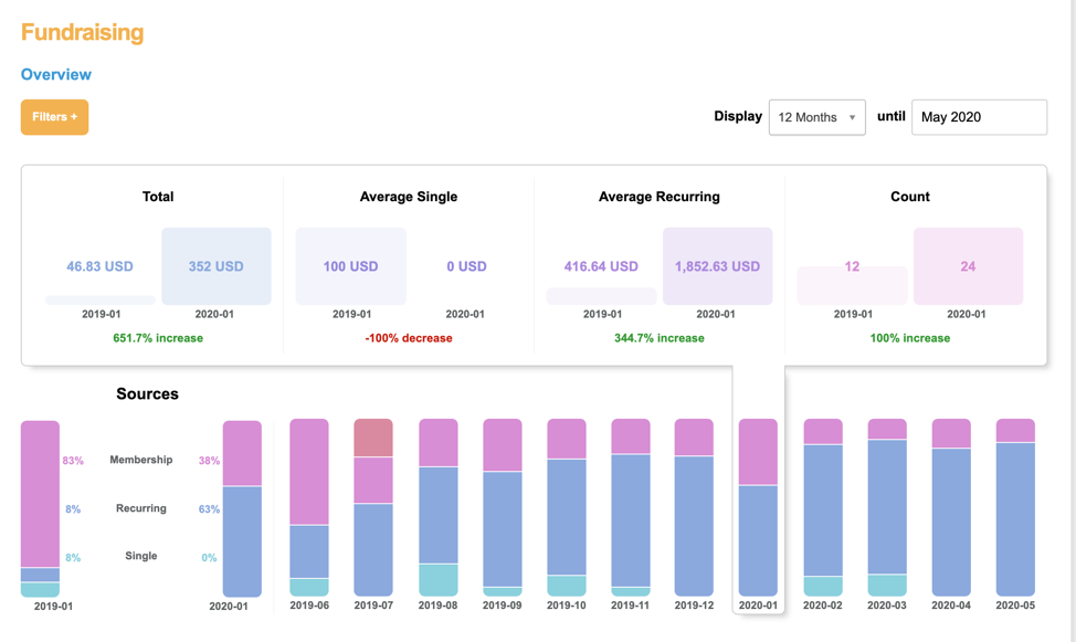
This report includes a summary of actions taken on Events, Membership, and fundraising pages (broken out by single and recurring gifts). This report can be displayed by quarter, month or day breakouts and the timeframe can be changed.
Source
Displays donations by page type with a quarterly, monthly or daily breakdown based on your selection. Clicking to select a day, month, or quarter will update the key metrics above to display metrics from that time period and a year over year comparison
Total: Total amount of donations during selected timeframe
Average single: Average one time donation amount during the selected timeframe
Average recurring Average recurring transaction during the selected timeframe.
Count: Number of donations during the selected timeframe.
Top Origins: The five most active origin sources with the highest number of donations. The origin is displayed along with the number of transactions processed.
Email Conversions: Five most active emails campaigns for donations
Single
This report only includes one-time donations and can be displayed by quarter, month or day breakouts and the timeframe can be changed. The main graph when the default page loads will show you key metrics with a year over year comparison based on the duration and timeframe selections:
Total Amount: Total of one-time gifts during the timeframe selected
Average Amount: Average one-time gift during the timeframe selected
Donation Count: Number of one-time gifts during the timeframe selected
Recurring
This report only includes recurring donations and can be displayed by quarter, month or day breakouts and the timeframe can be changed. The main graph when the default page loads will show you key metrics with a year over year comparison based on the duration and timeframe selections:
Total Amount: Total of recurring gifts during the timeframe selected
Average Amount: Average recurring gift during the timeframe selected
Donation Count: Number of recurring gifts during the timeframe selected
By Gateway
View performance by each gateway connected on your Engaging Network account. Compare to see how volume by gateway compares, as well as the single and recurring breakdown per gateway. This report can be displayed in timeframes of 4 quarters, 12 months, or 7 days and adjusted in date range accordingly. The ‘mode’ will display if the gateway is live (or active) on at least one page or if it is in test mode.
Devices
Pie charts breaking out the number of fundraising actions by supporter’s device, browser and operating system. This report can be displayed by quarter or month or day breakouts and the timeframe can be changed.
Device Type
Device OS
Desktop Device
Mobile Device
Desktop Browser
Mobile Browser
Values can be toggled on and off by clicking to add and remove them from the charts.
GA Channels
Count of fundraising actions by Google Analytics Channel (utm_source). This report can be displayed by quarter or month breakouts and the timeframe can be changed.
GA Campaigns
Count of fundraising actions by Google Analytics Campaign (utm_campaign). This report can be displayed by quarter or month breakouts and the timeframe can be changed.
GA Platforms
Count of fundraising actions by Google Analytics Platforms (utm_medium) This report can be displayed by quarter or month breakouts and the timeframe can be changed.
GA Content
Count of fundraising actions by Google Analytics Content (utm_content). This report can be displayed by quarter or month breakouts and the timeframe can be changed.
Overview
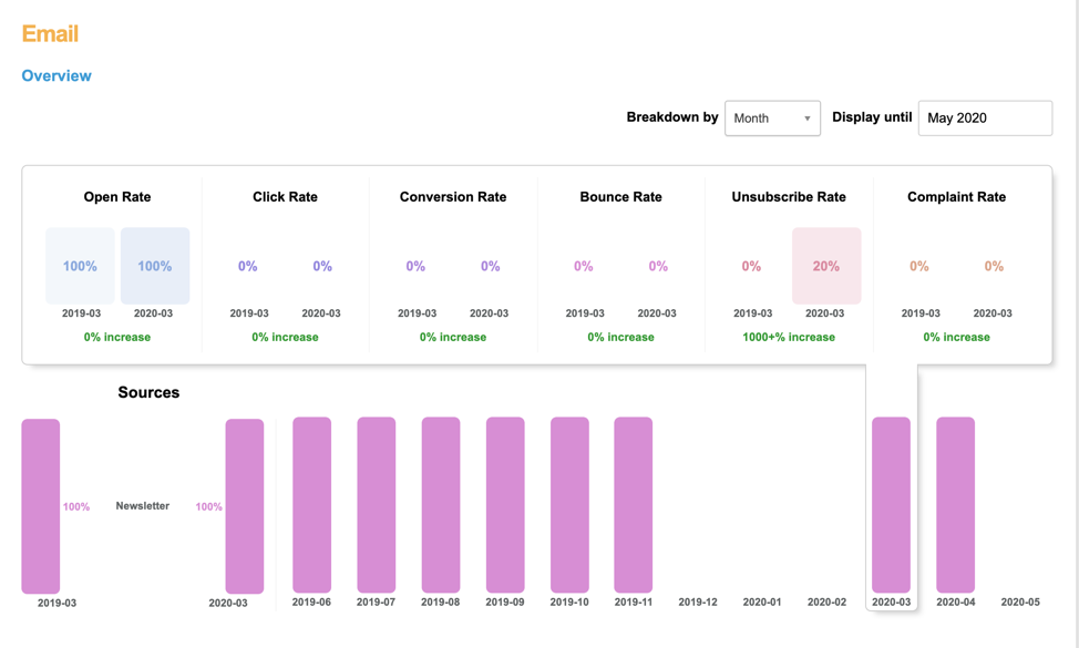
This report includes a summary of supporter interactions with emails. This report can be displayed by quarter, month or day breakouts and the timeframe can be changed.
The timeframe is based on the campaign send date not when the following events occurred.
Open Rate: Percentage of sent emails where a recipient opened
Click Rate: Percentage of sent emails where a recipient clicked a link
Conversion Rate: Percentage of sent emails where the recipient clicked to an Engaging Networks page and completed it
Bounce Rate: Bounces as a percentage of sent emails
Unsubscribe Rate: Percentage of sent emails where a recipient unsubscribed
Complaint Rate: Percentage of sent emails where a recipient reported the email as spam/ junk
Sources
Displays interactions by campaign type (Advocacy, Fundraising, or Newsletter) with a Monthly or Quarterly breakdown based on your selection. Clicking to select a month or quarter will update the key metrics above to display metrics from that time period and a year over year comparison
Domain Delivery
Report that hows the number of opens, clicks, completions, bounces, unsubscribes and complaints by email domain.
Engagement score
This pie chart shows the distribution of your supporters into each email engagement score from 0-11. You can also view the total count of records for each of the 11 categories here. The score represents the engagement of your supporters over the past 12 months (from the current month). An engagement score of “0” means all remaining “opted in” constituents created within the past 12 months. An engagement score of 100 represents all constituent records that do not have ANY opt-in activity. Note: You can access a report on engagement score 100 records under Email Suppression.
Devices
Pie charts breaking out the number of email actions by supporter’s device type and browser. This report can be displayed by quarter or month or day breakouts and the timeframe can be changed.
Queued Reports
Here you can find a list of Advocacy, Engagement or Fundraising reports that have had filters applied to them.
From here you can schedule reports to run automatically with the applied filters by selecting ‘schedule’.
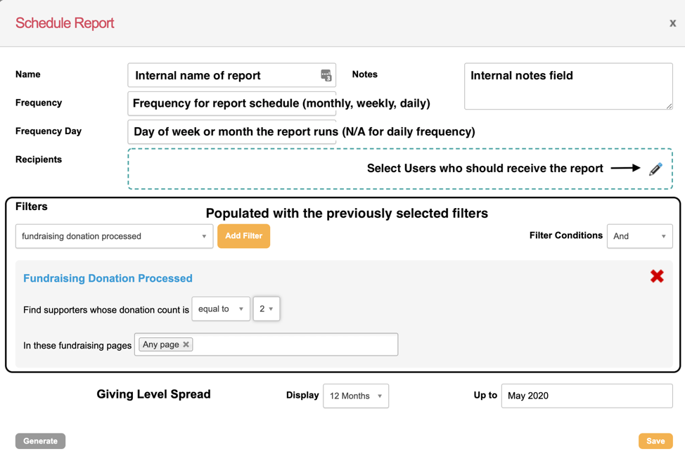
Scheduled Reports
Here you can find a list of Advocacy, Engagement or Fundraising reports that have had filters applied to them and have been scheduled to run periodically. You can edit them from this screen by selecting the pencil icon.
