Form blocks
The Form blocks tool is used to add forms blocks, field updates and field dependencies to your page-builder pages. Form blocks can contain a combination of form fields and questions and can be saved to your shared component library to be used on other pages if you choose. Form dependencies give you the ability to create dynamic behaviour on your pages based on supporter input.
Adding Form Blocks
To add a form block to your layout, expand the toolbar by hovering over it with your mouse.
Click on “Forms” to reveal the tool options, form block or form dependency.
Using your mouse, drag the form block into your layout.
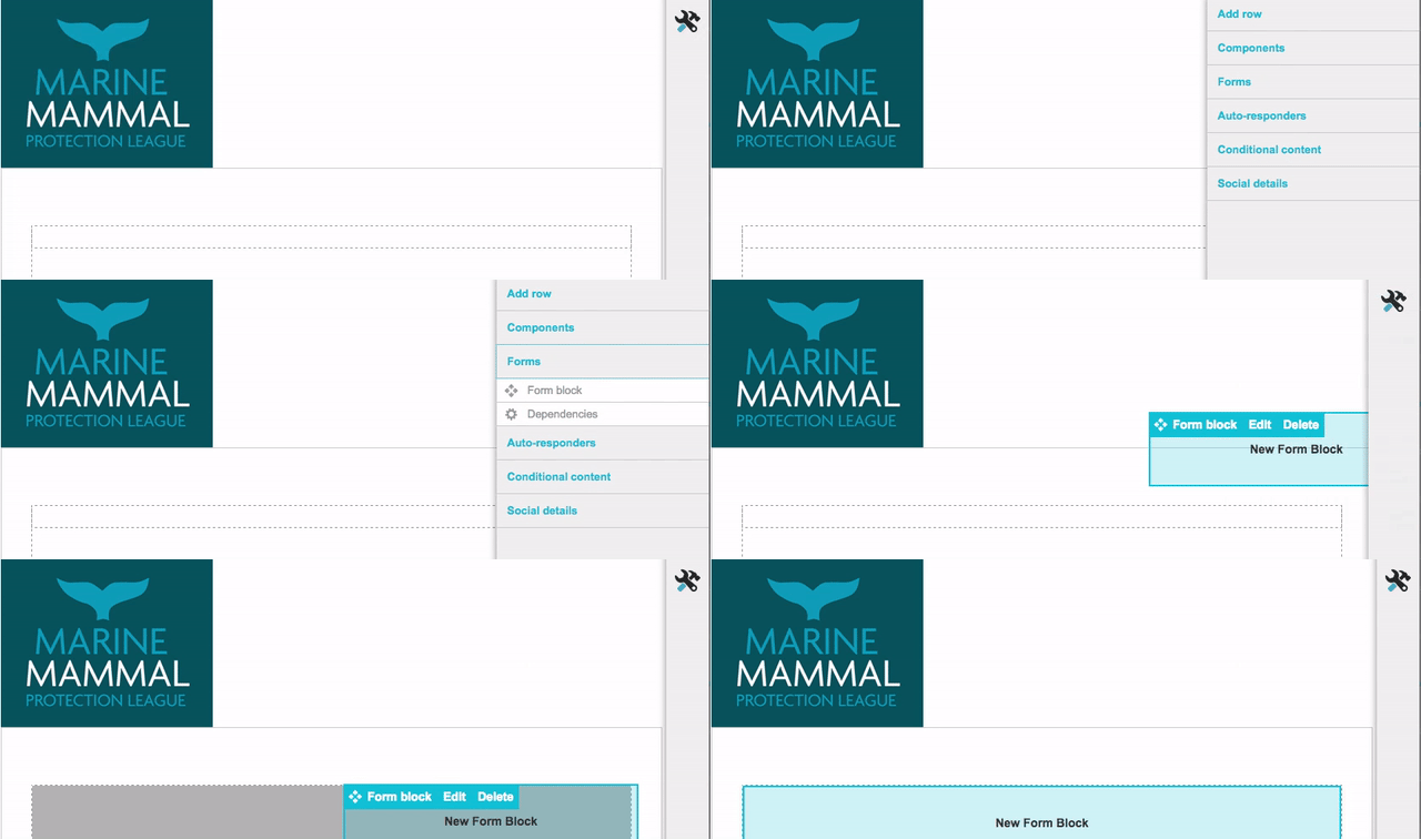
Form Blocks
Form blocks are how you collect data on the web page from your supporters. They can include any of your visible default supporter fields, questions, and opt-in questions. You can include multiple form blocks on a single page and select which one will display the submit button. This gives you full control of the forms look and feel.
When you first drag the form block into your layout the form block window opens.
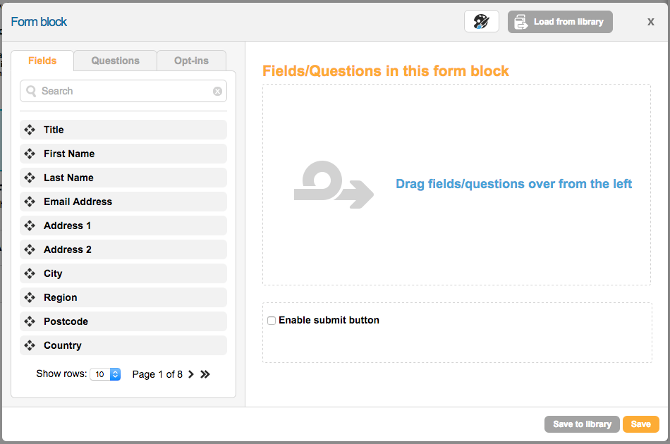
Adding Form Fields
To add a form field, drag it from the field list on the left side. Each field added will have the same configuration as was set under the default supporter record for the locale you’re using.
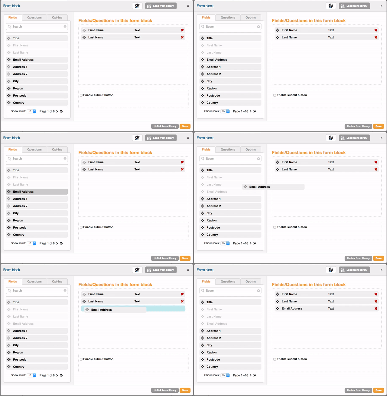
All fields are marked mandatory by default. Be sure to uncheck the mandatory button if you do not wish for the field to be required.
A page needs to have at least one mandatory field on it otherwise the page will be skipped.
Customizing form fields
If you need to change the configuration of the form field from the default settings, you can do so by clicking on the form field to reveal the field settings.
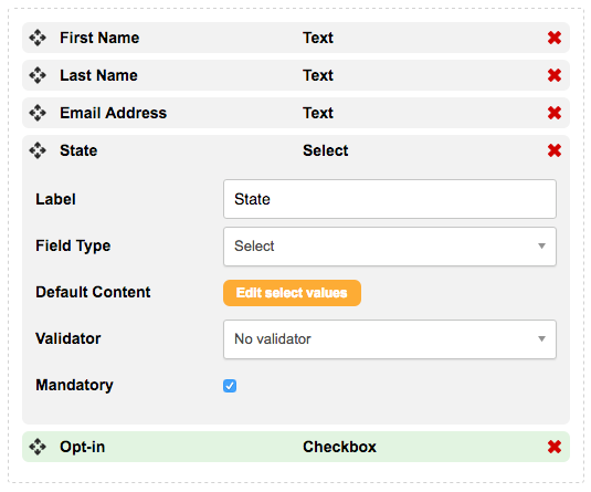
Once you have made the changes, click on the field name to hide the field settings. You can change the following:
Label – this is the text that appears above or to the left of the input
Field type – this is the type of input, such as Text or Checkbox. See below for more information
Default value – for text boxes, you can put a default value in, rather than have it blank
Default content – for Selects, Radios and Checkboxes you need to put extra content in since they can show multiple options
Validator – choose a validator if you wish to validate data on page submission
Mandatory – a mandatory field must contain content to be submitted. This is useful for required fields such as the Email Address. For checkboxes it means the checkbox must be ticked. For radios it means one of the radio inputs has to be selected.
You can set defaults for these fields in the Account Data Structure.
Field types
Which field type you choose is important:
Text – this is the default field type. A simple text box
Textarea – this is a multi-line text box, and is useful for comments
Select – a select (aka a dropdown) when clicked will display a choice of values. These are useful for inputs that can have a lot of set values, for example Title or Country. The Default Content is important – you have two types of content, a Label (displayed to the supporter) and a Value (that is actually saved and validated against). For example you might have a label of “United States”, but a value of “US”

The value is the one saved to the database, and is also the data that is checked in dependencies
Radio – a radio is like a Select in that you can choose one of several values. But they are all displayed at once so are useful for limited (2 or 3) choices (but more than 1). Only one can be selected at once. Like with selects, you have a label and corresponding value for each option. For example, you might have a label of “£10”, but a value of “10”
Checkbox – a checkbox is like a radio except that you can tick more than one at once. Often though you will just have one checkbox on screen. Like with selects, you have a label and corresponding value for each option. For example a label of “Gift aid?” and a value of “Y”
Uneditable text – this is a type of text box except you cannot type into it. You may want to put a default value in here, so the supporter can see that the text will be submitted but cannot change it. Or it could hold a dependency calculated value that depending on answers from other inputs, that you don’t want the supporter to change. Note that these are not pre-populated by campaign links in emails
Radio with input and Select with input – these are very much like their counterparts, but if the last option is chosen then a text box appears for the supporter to type their own choice into. They are useful for strings of donations for example (£2, £5, £10, Other)
Split text, Split select, Triple text, Triple select – these display 2 (for split) or 3 (for triple) text boxes or select boxes for the input. You can also set a delimiter, which will be saved between the values. This is useful for things like date of birth (use a triple select with / delimiter), expiry dates (use a split select with / delimiter), or sort codes (use a triple text with no delimiter). Note that any validation on this is on each individual field, not the entire value
Image select – this allows your supporter to choose one option from several choices (like a radio) by clicking an image. The value is stored as the answer.
Range – this allows your supporter to drag a slider to choose their answer. You set the minimum and maximum values (e.g. 0 and 100) using the additional settings that will appear for this input type. You can also set the increment (e.g. 10) as well as various display options.
Rating – this allows your supporter to click on a series of icons to determine their answer, which will be a numeric integer. For example, it might be used with a star rating out of 5. By clicking on the 4th star, say, then the answer will be stored as “4”. You can set the empty and filled images in the input’s settings when it is chosen.
Using a Next Suggested Gift (NSG) String
If you have created NSG components you can use them on your “Donation Amount” field within page-builder. When editing the “Donation Amount” field you can tick the box to enable a suggested gift string. Then choose the NSG string from the drop-down menu or click Manage to edit the NSG components.
Note that a NSG can only work on a select with input or radio with input field type.
Adding Questions
To add questions to your form blocks, click on the “Questions” tab and drag them into the form block.
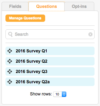
To create a new question, click on the “Manage Questions” button. For detailed instructions on creating questions read the help documentation here.
Customizing Questions
To customize the question, click on it to reveal the question settings.
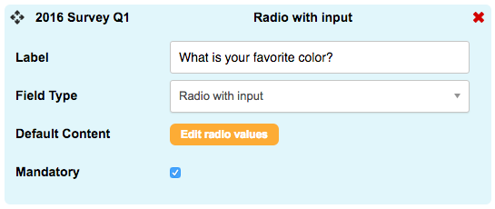
Once you have made the changes, click on the question name to hide the settings.
Adding Opt-ins
To add opt-in questions to your form blocks, click on the “Opt-ins” tab and drag them into the form block.
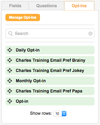
To edit the opt-ins or add a new one, click on the “manage opt-ins” button.
Adding a submit button
You can also use a form block to insert a submit button on your page. Add a new form block to the page and only check the “enable submit button” checkbox. Enter your button text and save.
To save the form block, click “Save”. To save the form block to use on other pages click “Save to library”.
Adding a CAPTCHA
You can also use a form block to insert a CAPTCHA on your page. This uses reCAPTCHA to add checkbox that proves you aren’t a bot spamming the page. Add a new form block to the page and only check the “enable captcha” checkbox then click save.
To save the form block, click “Save”. To save the form block to use on other pages click “Save to library”.
Styling Form Blocks
You can adjust some of the styles applied to the form block by clicking on the CSS editor icon ![]() at the top of the text block window. You have three sets of styling options available – form block styling, form field styling, and submit button styling.
at the top of the text block window. You have three sets of styling options available – form block styling, form field styling, and submit button styling.
Form Block Styling
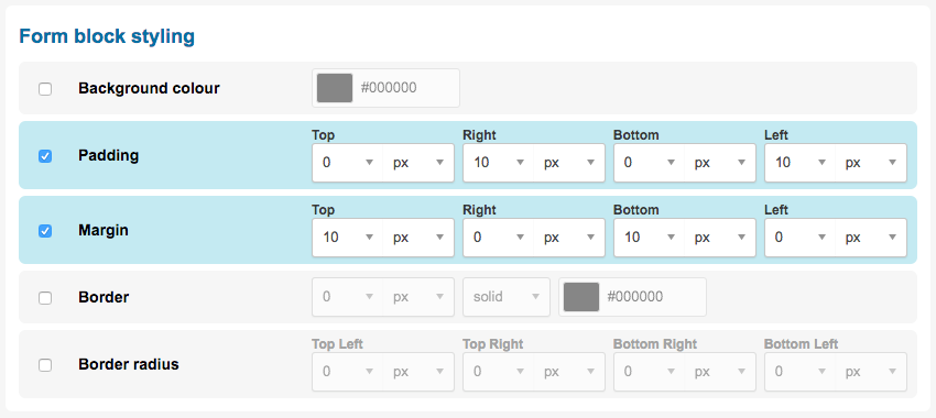
The following styling options are available for form block styles:
Style | Description |
|---|---|
Background color | Set the background color of the form block. |
Padding | Set the padding for the form block. These are measured in pixels, ems, rems, points, or as a percentage. You can also set top, right, bottom, and left sides independently. |
Margin | Set the margin for the form block. These are measured in pixels, ems, rems, points, or as a percentage. You can also set top, right, bottom, and left sides independently. |
Border | Set a border for the form block. These are measured in pixels, ems, rems, points, or as a percentage. You can also set top, right, bottom, and left sides independently. |
Border radius | Use this to add rounded corners to your form block. These are measured in pixels, ems, rems, points, or as a percentage. You can also set top, right, bottom, and left sides independently. |
Form Field Styling
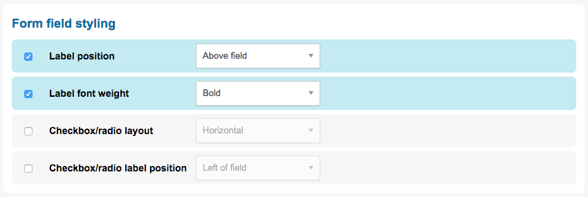
The following styling options are available for form field styles:
Style | Description |
|---|---|
Label position | Set if the field/question label should appear above or beside the field. |
Label font weight | Set if the label should be bold or regular. |
Checkbox/radio layout | Set the layout for the checkbox and radio button field types. They can appear horizontally or vertically on the page. |
Checkbox/radio label position | Set if the label for the checkbox and radio button field types should appear to the left or right of the fields. |
Submit Button Styling
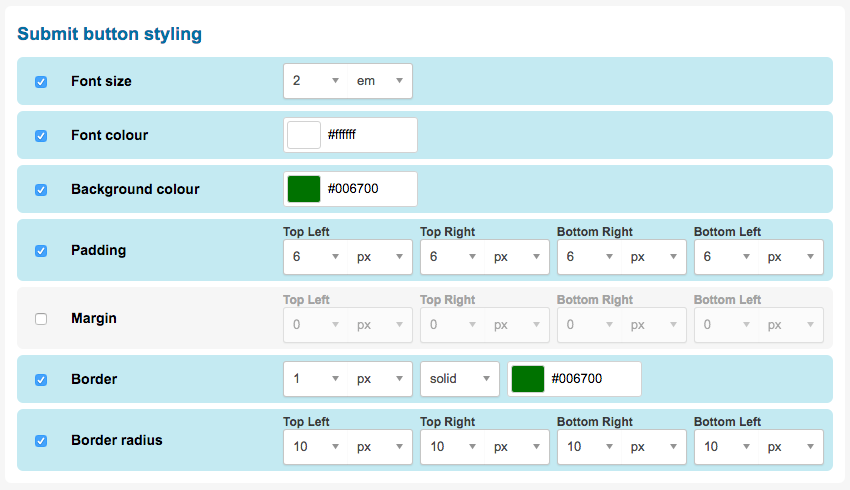
The following styling options are available for submit button styles:
Style | Description |
|---|---|
Font size | Set the size of the button text |
Font color | Set the color of button text |
Background color | Set the background color of the button |
Padding | Set the padding for the button. These are measured in pixels, ems, rems, points, or as a percentage. You can also set top, right, bottom, and left sides independently. |
Margin | Set the margin for the button. These are measured in pixels, ems, rems, points, or as a percentage. You can also set top, right, bottom, and left sides independently. |
Border | Set a border for the button. These are measured in pixels, ems, rems, points, or as a percentage. You can also set top, right, bottom, and left sides independently. |
Border radius | Use this to add rounded corners to your button. These are measured in pixels, ems, rems, points, or as a percentage. You can also set top, right, bottom, and left sides independently. |
Loading form blocks from the library
You can also load pre-built form blocks that are shared with other pages in your account by clicking the “Load from library” button at the top of the form block editor 
Select the form block you would like to use on the page and click “Use selected component” to load the form block.
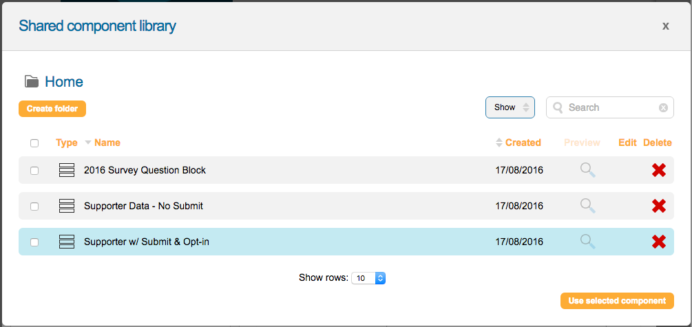
Once loaded, you can leave the form block linked to your library, or remove the link so you can make edits to the form block without affecting the other pages it’s shared to.
To unlink the form block, click the “Unlink from library” button next to the save button 
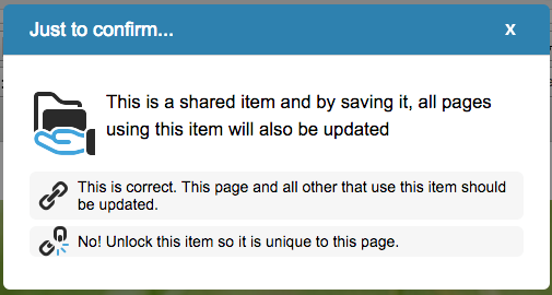
Otherwise, save your form block as normal. A dialog will open confirming that you want to use the linked content that also gives you the option to unlink the content.
Adding Field Dependencies
Dependencies allow you to add conditional behavior based on values selected by supporters in specific fields or questions to make your forms more interactive.
Note: you can also add Field Updates within the form block, that allow you to swap select lists and set values of other fields
You set the conditions the form fields or questions need to meet and an action that is executed when those conditions are met. See the article on form dependencies for details.
