
General Questions, limited to 2000 characters, can be used to collect additional information about a supporter using different question field types. They are distinct from opt-ins, which typically use a radio or checkbox field type to collect a ‘Y' (Yes) or 'N’ (No) response value, indicating a responder's consent or withdrawal of consent.
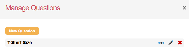
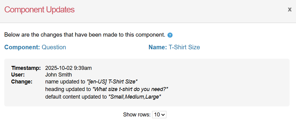
Adding, editing, deleting, checking usage and version history of a question
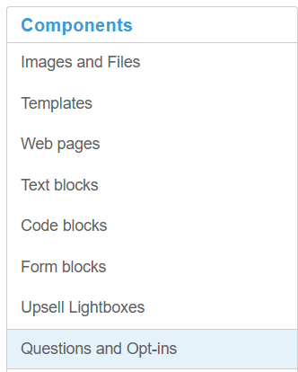
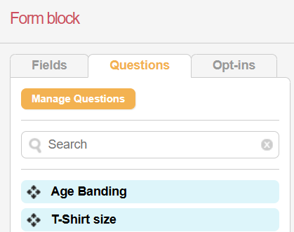
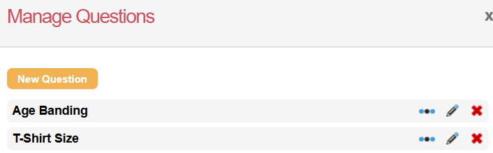
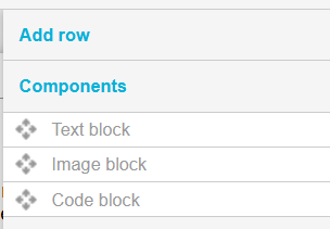
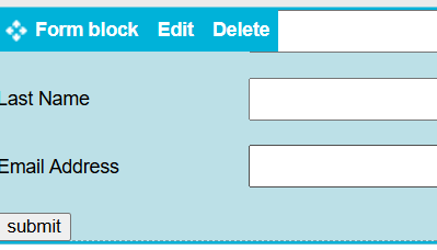
Questions are managed using either page components or a form block on individual pages.
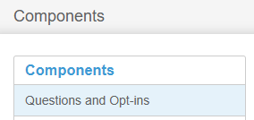
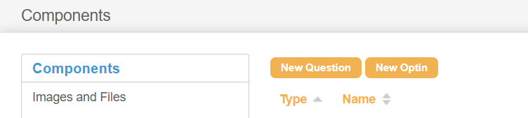
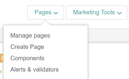
Using Components
|
|
||
|
|
||
|
|
||
|
|



Using page builder
|
|
||
|
|
||
|
|
||
|
|
||
|
|


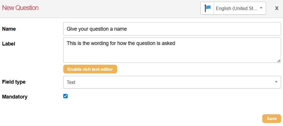
Required information for new questions
|
Name |
This is an internal name used for identifying your question.
|
|---|---|
|
Label |
This is the question you want to ask your supporters. Enabling the rich text editor allows you to edit the HTML source, add and remove links (for example, to a Terms and Conditions page), create anchor links and edit the formatting of the question label. |
|
Field Type |
You need to determine the type of field you would like to create: text field, text area, radio, select, or checkbox. split select, triple select, radio with input or select with input. |
|
Edit Values |
Once a field type is selected, you can set the default values to be used for the question. |
|
Mandatory |
Check or uncheck this depending on whether the question is mandatory or not. |
|
Locale |
If you have multiple locales on your account, you can use this to create the questions in a different language. |
Question values
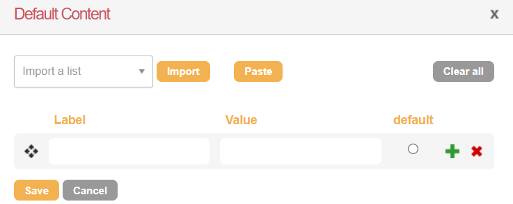
When creating a question, you are required to add a label and a value
Editing labels and values
|
Label: What the supporter on the page will see.
|
|
|
Editing questions and labels:
|
|


Choosing Question values
Two main question types can be created: question multiple response (QMR), question checkbox/opt-in (QCB), or Confirmation Question (CQS). There are specific single-character values that can determine the type of question created.
To avoid a single question having both QMR and QCB question type responses, avoid using the values Y, N, P, and D alongside other values, such as maybe.
The following illustrates how different values can generate two distinct question types: question multiple response (QMR), question checkbox/opt-in (QCB), or Confirmation Question (CQS).
|
Label |
Value |
Question Transaction Created |
|---|---|---|
|
Yes |
Yes |
QMR |
|
Yes |
Y |
QCB |
Field Types
When creating questions, you have multiple field types to choose from, which will affect how the question is displayed.
|
Type |
Transaction Type |
Description |
|---|---|---|
|
Text 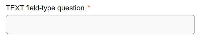
|
QMR | QCB |
A single-line text field for general input |
|
Text Area 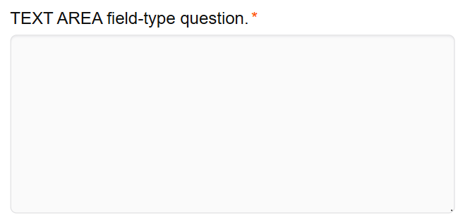
|
QMR | QCB |
A larger text field for general input |
|
Select 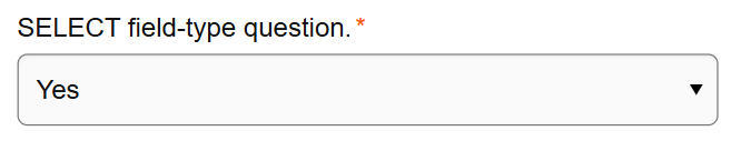
|
QMR | QCB |
Allows for a single selection from a dropdown of options |
|
Radio 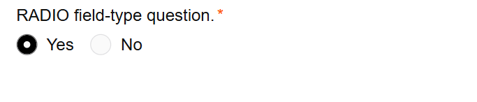
|
QMR | QCB |
Allows for a single selection from a group of options |
|
Checkbox 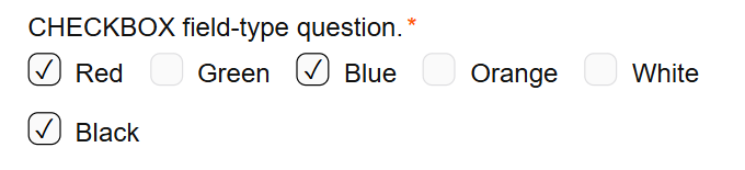
|
QMR | QCB |
Allows for multiple selections
|
|
Password 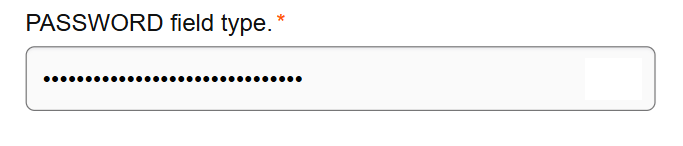
|
QMR | QCB |
A text field that hides the input characters (used for passwords) |
|
Split Text 
|
QMR |
A text field that is split into two sections and can optionally include a delimiter |
|
Split Select 
|
QMR |
A select field that is split into two sections and can optionally include a delimiter |
|
Radio with input 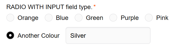
|
QMR | QCB |
Allows for a single selection from a group of options, with the last option opening a text box to input a value |
|
Select with Input 
|
QMR | QCB |
Allows for a single selection from a dropdown of options, with the last option opening a text box to input a value |
|
Uneditable Text* 
|
QMR | QCB |
The field value can be seen but not changed |
|
Triple Text 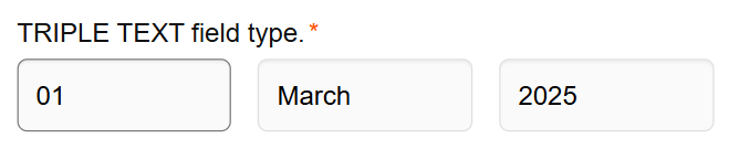
|
QMR |
A text field that is split into three sections and can optionally include a delimiter |
|
Calendar 
|
QMR |
Displays a calendar for the supporter to choose a date and formats dates as DD-MM-YYYY.
|
|
Hidden 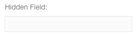
|
QMR | QCB |
Hides the field on Engaging Networks pages |

|
QMR |
Validates input as an email address |
|
Number 
|
QMR |
Accepts numeric values |
|
Telephone 
|
QMR |
Accepts telephone numbers.
|
|
Image Select 
|
QMR | QCB |
Allows for a single selection from a group of options, with the options configured as images |
|
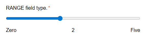
Range
|
QMR |
Displays a range selection widget with configurable min and max |
|
Rating 
|
QMR |
Displays filled or empty stars with a configurable max rating |
|
Token* 
|
QMR |
*Generally, this is not a field type used for questions |